Hover 효과가 사용자의 동작에 반응하는 인터랙션이라면, 애니메이션은 페이지 자체에 자연스러운 움직임을 더해 화면의 분위기를 만들어 줍니다. 이번 글에서는 히어로 섹션 배경에 은은하게 떠다니는 형태를 만들며, @keyframes의 기본 구조와 적용 방식을 정리해 보겠습니다.
애니메이션은 강하게 쓰기보다, 콘텐츠를 방해하지 않는 수준으로 부드럽게 적용하는 것이 중요합니다. 지금처럼 배경 장식 요소에 활용하면 시선을 과하게 빼앗지 않으면서도 화면 완성도를 높일 수 있습니다.
1. 애니메이션 정의하기 (@keyframes)
CSS에서 애니메이션을 만들 때는 @keyframes를 사용합니다. 시간의 흐름(0% ~ 100%)에 따라 스타일이 어떻게 변할지 정의하는 방식입니다.
이번 예제에서는 요소가 위아래로 천천히 움직이면서 살짝 커졌다가 돌아오는 float 애니메이션을 사용합니다. 시작과 끝 상태를 동일하게 두면 반복 재생 시 끊기는 느낌이 줄어들고, 훨씬 자연스럽게 보입니다.
/* style.css */

@keyframes float {
  /* 시작(0%)과 끝(100%) 상태: 원래 위치 */
  0%,
  100% {
    transform: translateY(0) scale(1);
  }

  /* 중간(50%) 상태: 위로 20px 올라가고 크기가 5% 커짐 */
  50% {
    transform: translateY(-20px) scale(1.05);
  }
}
이 구조는 다른 효과에도 그대로 응용할 수 있습니다. 예를 들어 좌우 이동, 회전, 투명도 변화도 같은 방식으로 정의할 수 있습니다. 핵심은 “시작 상태, 중간 변화, 복귀 상태”를 명확히 나누는 것입니다.
2. 요소에 애니메이션 적용하기
애니메이션을 정의했으면, 실제 요소에 animation 속성으로 연결합니다. 이번 예제에서는 히어로 배경 장식 요소인 .hero-shape에 적용합니다.
<!-- index.html 히어로 섹션 내부 -->
<div class="hero-shape"></div>
/* style.css */

.hero-shape {
  position: absolute; /* 부모(.hero)를 기준으로 위치 잡기 */
  top: -10%;
  right: -5%;

  width: 600px;
  height: 600px;

  /* 그라디언트 배경 */
  background: linear-gradient(45deg, var(--secondary), var(--primary));

  border-radius: 50%; /* 원형 */

  /* 블러 효과로 몽환적인 느낌 주기 */
  filter: blur(90px);
  opacity: 0.3; /* 반투명하게 */

  z-index: 0; /* 글자보다 뒤에 가도록 설정 */

  /* 애니메이션 적용: 이름(float), 재생시간(8s), 가속도(ease-in-out), 무한반복(infinite) */
  animation: float 8s ease-in-out infinite;
}
여기서 자주 조정하는 값은 8s와 ease-in-out입니다. 속도가 너무 빠르면 배경이 산만해 보일 수 있으므로, 현재처럼 느린 속도로 설정하는 편이 일반적으로 더 안정적입니다.
3. z-index 관리 (중요)
배경 장식이 텍스트를 가리지 않도록 레이어 순서를 명확히 관리해야 합니다. 장식 요소는 뒤(z-index: 0), 실제 콘텐츠는 앞(z-index: 1)으로 두는 방식이 가장 간단합니다.
.hero-content {
  z-index: 1; /* 배경(0)보다 높은 숫자 */
}
이 원칙을 기억해 두면, 이후 카드 배경 장식이나 섹션별 효과를 추가할 때도 겹침 문제를 훨씬 쉽게 해결할 수 있습니다.
4. 자연스럽게 보이게 만드는 실전 팁
애니메이션은 “보이게” 만드는 것보다 “자연스럽게” 만드는 것이 더 중요합니다. 다음 기준을 함께 확인해 보세요.
- 이동 거리: 너무 크면 산만해지므로 10~20px 범위에서 시작
- 재생 시간: 6~10초처럼 여유 있게 설정
- 반복 방식:
infinite를 쓰더라도 시작/끝이 튀지 않게 keyframe 연결 - 적용 대상: 텍스트나 버튼보다 배경 장식 요소에 우선 적용
이 기준만 지켜도 초보자 단계에서 과한 애니메이션으로 화면이 어수선해지는 문제를 많이 줄일 수 있습니다.
전체 코드 및 이미지
<!-- index.html -->
<!doctype html>
<html lang="ko">
<head>
<meta charset="UTF-8" />
<meta name="viewport" content="width=device-width, initial-scale=1.0" />
<title>포트폴리오 | Web Developer</title>
<!-- Google Fonts: Noto Sans KR -->
<link rel="preconnect" href="https://fonts.googleapis.com" />
<link rel="preconnect" href="https://fonts.gstatic.com" crossorigin />
<link
href="https://fonts.googleapis.com/css2?family=Noto+Sans+KR:wght@300;400;700;900&display=swap"
rel="stylesheet"
/>
<link rel="stylesheet" href="style.css" />
</head>
<body>
<nav id="navbar">
<div class="logo">MyPortfolio.</div>
<ul class="menu">
<li><a href="#home">Home</a></li>
<li><a href="#about">About</a></li>
<li><a href="#projects">Projects</a></li>
<li><a href="#contact">Contact</a></li>
</ul>
</nav>
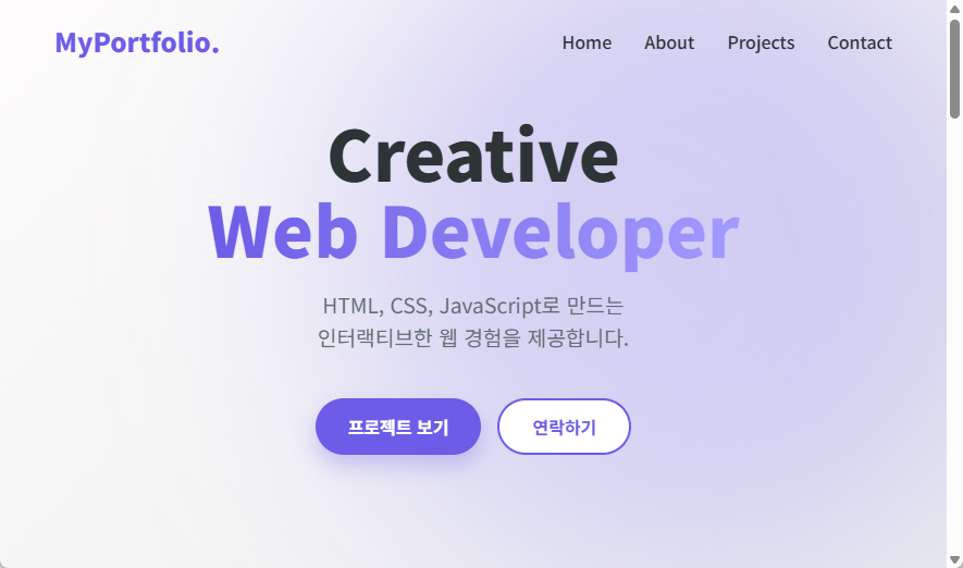
<header id="home" class="hero">
<div class="hero-shape"></div>
<div class="hero-content">
<h1>Creative<br /><span class="highlight">Web Developer</span></h1>
<p>HTML, CSS, JavaScript로 만드는<br />인터랙티브한 웹 경험을 제공합니다.</p>
<div class="btn-group">
<button class="btn primary">프로젝트 보기</button>
<button class="btn secondary">연락하기</button>
</div>
</div>
</header>
<section id="about" class="section">
<div class="container">
<h2>About Me</h2>
<div class="about-wrapper">
<img src="https://picsum.photos/300/300?grayscale" alt="Profile" class="profile-img" />
<div class="about-desc">
<h3>"코드로 가치를 만드는 개발자"</h3>
<p>
안녕하세요. 사용자 경험(UX)을 최우선으로 생각하는 웹 개발자입니다.<br />
깔끔한 코드와 직관적인 디자인을 통해 문제를 해결하는 것을 즐깁니다.
</p>
<div class="skills-container">
<span class="skill-tag">HTML5</span>
<span class="skill-tag">CSS3</span>
<span class="skill-tag">JavaScript</span>
<span class="skill-tag">React</span>
<span class="skill-tag">Node.js</span>
</div>
</div>
</div>
</div>
</section>
<section id="projects" class="section" style="background-color: #f8f9fa">
<div class="container">
<h2>My Projects</h2>
<p>최근 진행한 주요 프로젝트들을 소개합니다.</p>
<div class="project-grid">
<div class="project-card">
<img src="https://picsum.photos/600/400?random=1" alt="E-commerce App" class="project-img" />
<div class="project-info">
<h3>E-commerce App</h3>
<p>React와 Node.js로 만든 쇼핑몰</p>
</div>
</div>
<div class="project-card">
<img src="https://picsum.photos/600/400?random=2" alt="Portfolio Site" class="project-img" />
<div class="project-info">
<h3>Portfolio Site</h3>
<p>HTML/CSS만으로 만든 반응형 웹</p>
</div>
</div>
<div class="project-card">
<img src="https://picsum.photos/600/400?random=3" alt="Task Manager" class="project-img" />
<div class="project-info">
<h3>Task Manager</h3>
<p>생산성을 높여주는 투두 리스트</p>
</div>
</div>
</div>
</div>
</section>
<section id="contact" class="section">
<div class="container">
<h2>Contact Me</h2>
<p>새로운 프로젝트와 협업 제안을 기다리고 있습니다.</p>
<form class="contact-form">
<input type="text" placeholder="이름" />
<input type="email" placeholder="이메일" />
<textarea rows="5" placeholder="메시지"></textarea>
<button type="submit" class="btn primary">보내기</button>
</form>
</div>
</section>
<footer>
<p>© 2026 My Portfolio. All rights reserved.</p>
</footer>
</body>
</html>
/* style.css */
@import url('https://fonts.googleapis.com/css2?family=Noto+Sans+KR:wght@400;500;700;900&display=swap');

:root {
  --primary: #6c5ce7;
  --secondary: #a29bfe;
  --dark: #2d3436;
  --light: #f9f9f9;
}

* {
  margin: 0;
  padding: 0;
  box-sizing: border-box;
  font-family: 'Noto Sans KR', sans-serif;
}

html {
  scroll-behavior: smooth;
}

body {
  background-color: var(--light);
  color: var(--dark);
  overflow-x: hidden;
}

nav {
  position: fixed;
  top: 0;
  width: 100%;
  padding: 20px 50px;
  display: flex;
  justify-content: space-between;
  align-items: center;
  z-index: 1000;
  transition: all 0.4s ease;
}

.logo {
  font-size: 1.5rem;
  font-weight: 900;
  color: var(--primary);
  cursor: pointer;
}

.menu {
  display: flex;
  list-style: none;
  gap: 30px;
}

.menu a {
  text-decoration: none;
  color: var(--dark);
  font-weight: 500;
  transition: 0.3s;
}

.menu a:hover {
  color: var(--primary);
}

.hero {
  height: 100vh;
  display: flex;
  align-items: center;
  justify-content: center;
  text-align: center;
  position: relative;
  background: linear-gradient(135deg, #fdfbfb 0%, #ebedee 100%);
}

.hero h1 {
  font-size: 4rem;
  line-height: 1.1;
  margin-bottom: 20px;
  font-weight: 900;
}

.highlight {
  background: linear-gradient(to right, var(--primary), var(--secondary));
  -webkit-background-clip: text;
  background-clip: text;
  color: transparent;
}

.hero p {
  font-size: 1.2rem;
  color: #636e72;
  margin-bottom: 40px;
  line-height: 1.6;
}

.btn-group {
  display: flex;
  gap: 15px;
  justify-content: center;
}

.btn {
  padding: 12px 30px;
  border-radius: 50px;
  font-size: 1rem;
  font-weight: 700;
  cursor: pointer;
  transition:
    transform 0.2s,
    box-shadow 0.2s;
  border: none;
}

.btn.primary {
  background: var(--primary);
  color: white;
  box-shadow: 0 10px 20px rgba(108, 92, 231, 0.3);
}

.btn.secondary {
  background: white;
  color: var(--primary);
  border: 2px solid var(--primary);
}

.btn:hover {
  transform: translateY(-3px);
}

.hero-shape {
  position: absolute;
  top: -10%;
  right: -5%;
  width: 600px;
  height: 600px;
  background: linear-gradient(45deg, var(--secondary), var(--primary));
  border-radius: 50%;
  filter: blur(90px);
  opacity: 0.3;
  z-index: 0;
  animation: float 8s ease-in-out infinite;
}

@keyframes float {
  0%,
  100% {
    transform: translateY(0) scale(1);
  }
  50% {
    transform: translateY(-20px) scale(1.05);
  }
}

.hero-content {
  z-index: 1;
}

.section {
  min-height: 100vh;
  padding: 100px 20px;
  background: white;
  display: flex;
  justify-content: center;
}

.container {
  max-width: 800px;
  text-align: center;
}

.about-wrapper {
  display: flex;
  align-items: center;
  justify-content: center;
  gap: 60px;
  margin-top: 50px;
  text-align: left;
}

.profile-img {
  width: 280px;
  height: 280px;
  border-radius: 50%;
  object-fit: cover;
  box-shadow: 20px 20px 0px var(--secondary);
  border: 5px solid white;
}

.about-desc {
  flex: 1;
  max-width: 500px;
}

.about-desc h3 {
  font-size: 1.8rem;
  margin-bottom: 20px;
  color: var(--primary);
}

.about-desc p {
  font-size: 1.1rem;
  line-height: 1.7;
  color: #636e72;
  margin-bottom: 30px;
}

.skills-container {
  display: flex;
  flex-wrap: wrap;
  gap: 10px;
}

.skill-tag {
  padding: 8px 16px;
  background: white;
  border: 1px solid var(--secondary);
  color: var(--primary);
  border-radius: 20px;
  font-weight: 600;
  font-size: 0.9rem;
  transition: 0.3s;
  cursor: default;
}

.skill-tag:hover {
  background: var(--primary);
  color: white;
  transform: translateY(-3px);
  box-shadow: 0 5px 15px rgba(108, 92, 231, 0.3);
}

.project-grid {
  display: grid;
  grid-template-columns: repeat(auto-fit, minmax(280px, 1fr));
  gap: 30px;
  margin-top: 50px;
  width: 100%;
  max-width: 1000px;
}

.project-card {
  background: white;
  border-radius: 15px;
  overflow: hidden;
  box-shadow: 0 10px 20px rgba(0, 0, 0, 0.05);
  transition: transform 0.3s ease;
  text-align: left;
}

.project-card:hover {
  transform: translateY(-10px);
}

.project-img {
  width: 100%;
  height: 200px;
  object-fit: cover;
}

.project-info {
  padding: 20px;
}

.project-info h3 {
  margin-bottom: 10px;
  color: var(--dark);
  font-size: 1.2rem;
}

.project-info p {
  font-size: 0.9rem;
  color: #636e72;
  margin-bottom: 0;
  line-height: 1.4;
}

.contact-form {
  display: flex;
  flex-direction: column;
  gap: 15px;
  width: 100%;
  max-width: 500px;
  margin-top: 40px;
}

.contact-form input,
.contact-form textarea {
  padding: 15px;
  border: 1px solid #dfe6e9;
  border-radius: 8px;
  font-size: 1rem;
  font-family: inherit;
  resize: vertical;
}

.contact-form input:focus,
.contact-form textarea:focus {
  outline: none;
  border-color: var(--primary);
}

footer {
  padding: 30px;
  text-align: center;
  background-color: var(--dark);
  color: rgba(255, 255, 255, 0.7);
  font-size: 0.9rem;
}
마무리
이번 단계에서는 @keyframes로 애니메이션을 정의하고, animation 속성으로 실제 요소에 연결하는 과정을 살펴보았습니다. 또한 z-index를 함께 관리해 시각 효과와 가독성을 동시에 유지하는 방법까지 정리했습니다.
정리하면 핵심은 세 가지입니다. 첫째, keyframe은 시작-중간-끝 상태를 명확히 정의할 것. 둘째, 속도와 이동량은 과하지 않게 조절할 것. 셋째, 콘텐츠 레이어를 보호하기 위해 z-index를 반드시 함께 설정할 것입니다.
다음 글에서는 미디어 쿼리(Media Query)를 사용해 화면 크기에 따라 레이아웃이 자연스럽게 바뀌도록 반응형 구성을 이어서 살펴보겠습니다.
감사합니다.